
Workshop 1 – Proposing a new way of producing conceptual figures
This workshop was presented in three stages, starting with an initial activity and followed by two stages of presentations and group discussions. Approximately 20 members of the neuroimaging department participated in the workshop.

Stage 1
The initial activity centred on a case study; an upcoming review paper, aimed at a broad but knowledgeable audience, that discusses intra-nasal drug delivery in humans. The workshop participants were divided into five groups of four and were tasked with producing a conceptual figure, or figures, that visualised a particular scenario.
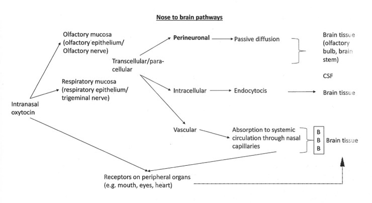
Yannis gave a short description of the scenario – pathways from the nose to the brain that may be utilised during intra-nasal drug delivery – using the flowchart shown below as a visual representation of those pathways.
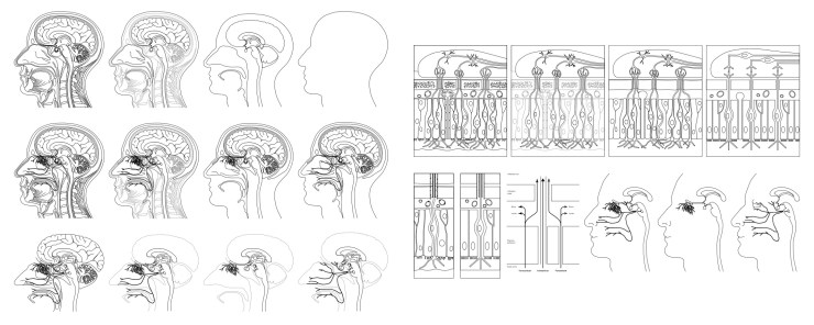
The participants were then provided with printout of all the images shown below, both at approximate A5-size and at a much smaller scale. They were also provided with scissors, glue sticks and a range of drawing tools. They were asked to create the conceptual figures from the provided images, adding whatever text, annotation, colour or additional drawing that they deemed necessary. The figure(s) had to put together on one A3 sheet of paper.
Photographs of the resulting A3 sheets are shown below:


Conclusions from Stage 1 of Workshop 1
The scenario for the activity had been deliberately chosen to fit in with the work that Gill had already been undertaking for the upcoming journal papers by Yannis and Nisha. However, it was obvious from the feedback that some participants were not familiar with the topic of intra-nasal drug delivery, found the explanation insufficient and the activity confusing. Those participants who did understand the scenario found the activity more enjoyable. The scenario did come across as being more complex than Gill had anticipated, which meant that the time allocated to the activity was probably not adequate. A simplified scenario, more explanation and a longer time-frame would all have all helped.
The focus of the activity was intended to be on the choice of images, the additions that the participants chose to make to the images and the group discussions that led up to those choices. However, this was not made clear enough at the start of the activity and some participants expected a critique of their output – the A3 sheets – in terms of their success as information design. It seemed clear that some participants had not read the workshop webpages prior to the session and were expecting the workshops to be more along the lines of instruction in information design / graphic design, rather than a discussion of conceptual figures. A clearer declaration of the aim of the workshop, both in the announcements prior to the workshop and at the start, would have helped. Also, although Gill tried to reference the activity outcomes in the stage 2 discussion, this should have been emphasised more and been given more time. However, the activity itself took a little longer than expected and consequently time was tight. More explanation all round would undoubtedly help.
For those department members who are interested in more guidance on information design, this blog post about the books of Edward Tufte is a good starting point.
Stage 2
The second stage of the workshop was a discussion of the issues involved in generating conceptual figures, starting with the story that is being told. Is that story reviewing current knowledge (such as in a review paper), presenting experimental results or methods (in data papers, posters or presentations) or teaching (typically in presentations). Also to be considered is the audience for that story, which can be broadly categorised into three types: a broad, but knowledgeable, audience that requires some context; a highly specialised audience with significant apriori knowledge; an inexperienced audience, requiring a lot of background information. Participants were asked to consider how their conceptual figures would vary depending on the story and the audience, even if the subject matter was the same.
How the story would be told was also discussed, with consideration given to the use of conceptual figures in (below, from left) journals, posters and presentations, and the variation in figure size, number and appearance that each format provides.

The printing of colour figures in greyscale, with a potential loss of their effectiveness to visually communicate, was discussed and had been covered previously in this blog post. Relatively small changes to a colour figure, in terms of increasing tonal differences and adding dark outlines, can greatly improve their appearance in greyscale (as shown below). This is particularly important in diagrammatic figures, where colours often signify difference, but of generally less significance for anatomical images.
Also discussed was how the conceptual figures would tell that story, including the desirability of having a arrange of visually consistent images of the same subject that vary in their scale and detail (as shown below), a subject which had been covered previously in this blog post.

Conceptual figures covering the same subject can vary widely in their appearance, from completely anatomical to completely diagrammatic (as shown below and also covered in this blog post and this blog post). The outputs from the activity included a range of representations of the olfactory epithelium, for example (shown below), and it did not seem obvious when you would choose one form of representation over another.

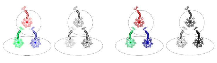
How to visually represent the various elements that make up a figure can also vary widely, which contributes to an inconsistency from one figure to another. The role of visual elements in conceptual figures was discussed in this blog post. Gill has been collecting figures containing various visual elements associated with intra-nasal drug delivery on the neurographical instagram feed, and these highlight this variability. This is particularly true for the visual representation of nuclei, with a selection shown below.

Yannis had provided Gill with a copy of a review paper on the intra-nasal delivery of oxytocin, and figures from this paper (shown below) were used to highlight some of the issues that had been discussed. The graph in figure 1 would almost certainly not work if reproduced in greyscale, as there would be little or no distinction between the green and turquoise colours. Increasing the tonal difference between the colours, or adding a thin black line between the coloured areas, would resolve that problem.
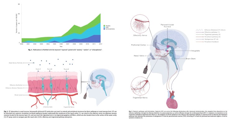
Figure 2 is very similar in appearance to many of the outcomes produced during the stage 1 activity. However, the image of the olfactory epithelium is upside down when compared to how it should appear in the head, which causes unnecessary confusion. Perhaps the image could not be inverted because it already contained text and annotation that could not be edited. Also confusing is the use of colour, as the turquoise nerves in the epithelium are coloured pink in the image of the head.
Figure 3 contains the same image of the head that is used in figure 2. A better option may have been a zoomed-in image, highlighting the nerves and associated parts of the brain. This would have removed the need for the pop-out images of the nerves, which do not provide much additional information. Instead, an additional image highlighting the hypothalamus may have been more useful. There was also some discussion of the image of the heart, and whether a visual representation, as opposed to simple text, was really necessary.
[Reference: Quintana, D.S., Alvares, G.A., Hickie, I.B., Guastella, A.J. (2015) Do delivery routes of intranasally administered oxytocin account for observed effects on social cognition and behavior? A two-level model. Neuroscience and Biobehavioral Reviews 49 (2015) pp182-192.]
Conclusions from Stage 2 of Workshop 1
As the collaboration is only halfway through, Gill has not yet investigated the use of conceptual figures in posters and presentations, as opposed to journal papers. Several participants noted in their feedback that they would have liked more examples during the presentations, and this is one area where examples are lacking at the moment. The use of posters, in particular, provoked some discussion, as an A0-sized poster provides a lot of space, which can be difficult for a designer to use effectively and for a viewer to navigate through. Gill also raised the issue of constructing a narrative using images, as seen in comic books and graphic novels. The work of graphic artists could certainly provide inspiration for the design of posters and presentations, where there is generally more freedom, in graphic design terms, than in journal papers. The use of simple 2D animations in presentations was also mentioned by Gill and is another topic that could be looked at during the collaboration.
The issue of converting colour images to greyscale also provoked discussion and some participants had not previously given this topic much thought. Providing a simple way for department members to convert their images to greyscale, and check that they still work visually, would be useful. This conversion can be easily done in Adobe software, such as Illustrator, Photoshop or InDesign.
Stage 3
This stage of the workshop proposed a new method for producing conceptual figures. This is assuming that, at the moment, department members use one, or more, of the following approaches: employ a professional illustrator; use PowerPoint; use an expired Illustrator licence (or similar); get help from artistic friends and family; borrow slides and figures from colleagues; raid Google Image.
Regarding Google Image, Gill had a cautionary tale regarding one of the images she had recently posted to the neurographical instagram feed. This was an image of a rat nasal cavity (shown below right) which Gill had re-drawn from an existing conceptual figure, downloaded from Google Image (shown below left).

The posted image provoked comments regarding the inaccurate depiction of the turbinates. The comments were made Prof. Dr. Trese Leinders-Zufall, of Saarland University in Germany, who had produced the original image and then subsequently realised it was erroneous. However, by then the image had already been copied by others, including whoever had produced the image re-drawn by Gill. The story shows the difficulty of verifying the accuracy of images found via Google, but also the impossibility of retrieving inaccurate images once they are available on the internet. Images are downloaded, copied and re-used many times over, as any search of Google Image reveals.
One scientist who avoids using Google Image by producing his own images is Dr Robert G. Thorne of Wisconsin University in the United States. His work has been covered previously in this blog post.
From initial discussions with the team, a range of issues had been raised (covered in this blog post) that it was hoped could be addressed during the course of the collaboration. Among the requirements of the collaboration were: finding an easier way for scientists themselves to produce conceptual figures; making available a range of adaptable figures, to suit different media and different audiences; creating figures with a consistent appearance, to give the department a more obvious visual style and individual articles / presentations more authority.
In order to achieve this, Gill proposed what was effectively a digital version of the stage 1 activity. Instead of a sheaf of paper printouts and a selection of drawing tools, department members would have access to a digital library (stored in a shared folder) and would be able to view and select the available images via an online image gallery. They would then have the ability to edit the digital files and produce the own images to add to the library, which would require the use of Adobe Illustrator software.
The key to making the most of Illustrator is the use of layers, as shown in the examples below. This was covered previously in both this blog post and this blog post.

The way that images are constructed can ensure that they are easy to edit and adapt, which Gill envisaged as being a 2D equivalent of 3D anatomical teaching models, such as those constructed by Dr Louis Auzoux in the 19th century (shown below left). Once a detailed image has been generated (as shown top left of the four drawings on the right) it is relatively quick and easy to produce a range of related images (as the other three drawings demonstrate).

This approach to constructing images, particularly for anatomical images, was covered in this blog post.
There was some discussion of the pros and cons of the proposed approach. Among the advantages should be: easy access to a wide range of reliable images; quick to generate a range of images from one initial, detailed image; the ability to find, edit or create an image that exactly meets your needs; the opportunity to use visually consistent images through a paper, poster or presentation; the creation of a recognisable visual identity for the department.
The main disadvantage of the approach is that it would require some effort on the part of department members. Although a professional designer could be tasked with generating enough initial images to get the digital library up and running, the scientists themselves would have to be prepared to create and edit images and add them to the library. Also, maintaining a visual style or identity requires continued effort from all involved.
There was some concern over the term ‘visual identity’, as that sounds a bit too much like a brand, which is not what the department need. Gill explained that the term ‘consistent visual style’ is probably more appropriate, and this could be something as simple as using a certain colour palette, or always outlining images in a certain way. The conceptual figures produced by the journal Nature, for example, are very recognisable due to their use of colour, but do not stick to a rigid ‘identity’. Also, templates or guidelines supplied either by King’s or by the publishing journal or conference would have to be accommodated, so some degree of flexibility would be required.
The first step is to introduce the department members to Adobe Illustrator, via Workshop 2, and then see how many are interested to take it further.
Conclusions from Stage 3 of Workshop 1
The proposal did generate some positive feedback – the image gallery website in particular – with some participants already looking forward to Workshop 2. It is certainly not expected that all members of the department will be keen to get involved with Illustrator. However, it is hoped that at least three or four people will want to produce their own figures and this, in conjunction with help from a professional designer, could be enough to get the image library started and to keep it growing.
