
This blog post summarises the issues that have been raised, about the generation and use of conceptual scientific figures, during the meetings held to date. This is by no means a comprehensive list of all the issues that can be considered when generating conceptual figures – there has been no discussion yet of the use of text, for example, or more general information design topics. These will be addressed in due course, but the issues discussed in the meetings so far are listed below:
Scientists who generate their own conceptual figures
Dr Robert G. Thorne of Wisconsin University is one example of a scientist who creates his own figures – the rat brain at the top of this post was re-drawn from one of his figures. There must be other scientists who do the same. This also leads on to the topic of re-using figures, or elements of figures, in future journal papers (as Dr Thorne does). How easy is it for scientists to edit or adapt existing figures for a new purpose? Does the re-use of scientific figures partially explain the relatively slow change in the appearance of these images, when compared to other areas of graphic design?
(6th July 2017 – See this blog post for more information about Dr Thorne)
Conceptual figures often contain a lot of complex information
Many conceptual figures contain a lot of detailed visual information, which can make them difficult to read and interpret, even for the intended audience. Space in journal articles can be very restricted, with the result that everything the scientist is trying to communicate may have to be crammed into one figure. Is all of this information necessary, or are there extraneous elements that could be removed to make the figure easier to comprehend, without affecting the scientific content? Would two or three smaller, but simpler, figures be more effective than one large, but complex, figure? Is there ever a temptation to add more detail to make the figure appear more authoritative or just more interesting?
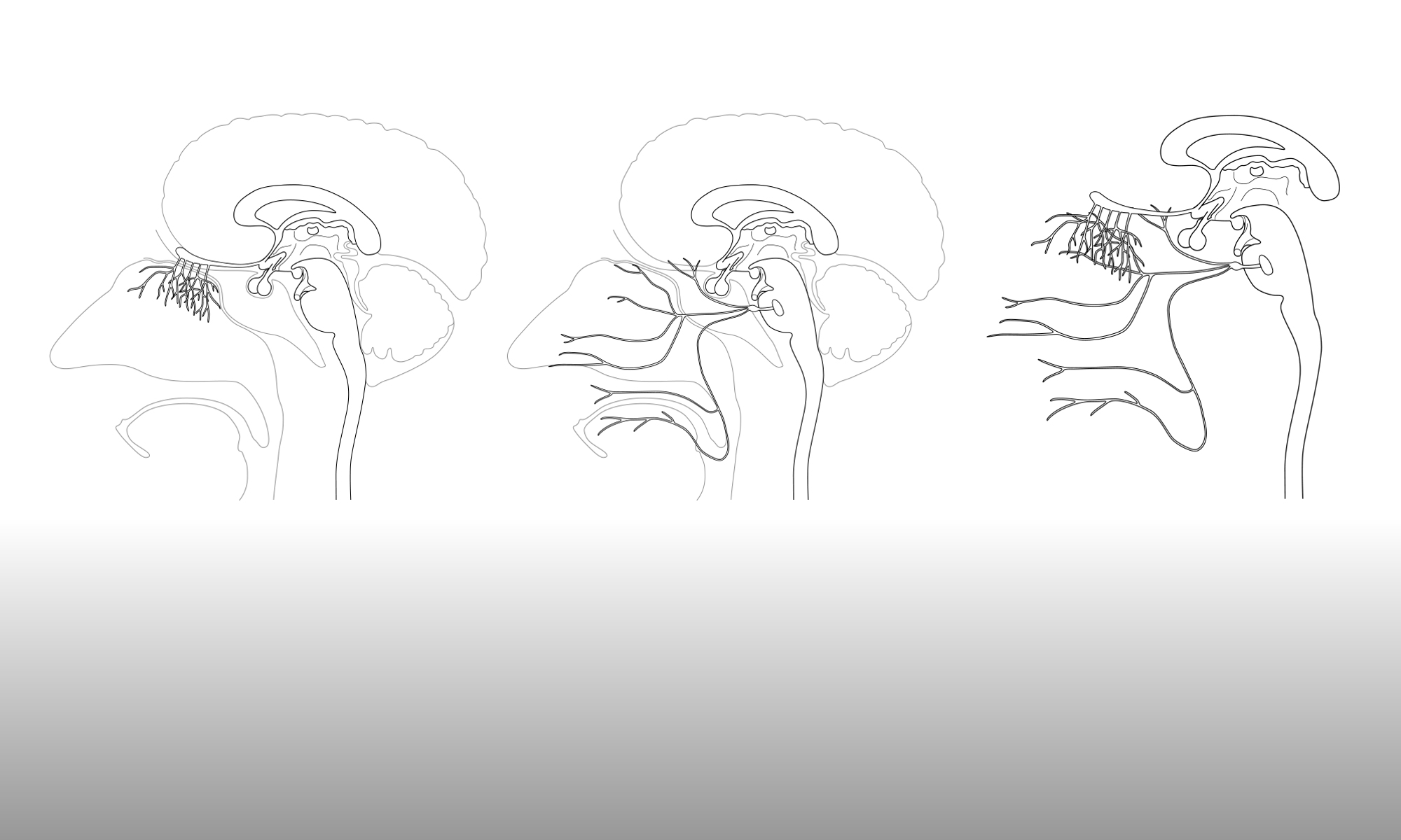
The same process can be visually represented in different ways
Even from the relatively few journal articles reviewed in the meetings, it is obvious that the same concept or process can be visually represented in different ways. Which versions work best for the audience, and why? What are the common denominators that have to be present in a figure for the concept to be easily recognised by the audience?
Colours …
Although some visual elements are a particular colour by convention (e.g., red for arteries and blue for veins in figures depicting blood circulation), most elements used in neuroscience figures have no defined colour. Consequently, the use of colour is something of a free-for-all and the choices made are not always well-considered or consistent. If several figures, obtained from different sources, are used within one presentation then the same elements can be coloured differently in each figure, which can be confusing to an audience. How much thought is given to the use of colour, particularly the consistency of colours within an article or presentation? If a figure is to be presented in both colour and black-white, is this taken into account when the figure is created?
Shapes …
Although colour is often arbitrary, the shape of an element is usually indicative, particularly if the shape resembles the appearance of that element ‘in real life’. How abstracted can these shapes become and still remain recognisable? With increased abstraction, does the surrounding context of that element become increasingly important, to aid recognition?
The relative importance of conceptual figures
For the majority of journal papers and conference presentations, the most important aspect is the presentation of experimental results. Visual representations of the data, in the form of graphs, tables and images, take precedence over any conceptual figures. These figures can therefore be reduced in number, in size or removed altogether. If a scientist has limited time and resources to put together a paper or presentation, is the preparation of the conceptual figures seen as a low priority? If so, how much does this matter?
The impact of the publishing journal on conceptual figures
The choice of a publishing journal is made early in the life of a paper and can have a profound affect on the conceptual figures, in terms of their number, size, appearance and whether they are published in colour, black and white, or both. When and how are these limitations taken into account as the figures are produced? Does a journal’s attitude to figures ever influence the choice of journal for publication?
Creating different versions of the same conceptual figure
A conceptual figure that may be suitable for a journal paper may not work well when used in a conference presentation or as part of a poster. Are different versions of the same figure generated for these different contexts, to ensure that the figures have the maximum effect? A single, complex figure in a paper would work better as several simpler figures in a presentation, where space is not an issue but each figure is shown for a limited time. Equally, are different versions of a figure produced for different audiences? A neuropsychologist may not require the level of detail in the depiction of a drug pathway that a neuropharmacologist may expect to see. What happens if a paper or presentation is cross-disciplinary?
How anatomically correct does a conceptual figure have to be?
Or, conversely, how diagrammatic can a conceptual figure be? Is it important that conceptual figures that depict biological elements are also anatomically correct? Or does this depend on the concept that is being represented, e.g., a figure showing a drug pathway may not need detailed and accurate depictions of cell types in order for its scientific message to get across.
The use of animation
Simple 2D animations are relatively easy to produce, if a little time-consuming. Could they be used as an alternative to sequential static images within a presentation? Would this be the best way to show a process that moves or changes with time?

One Reply to “”