

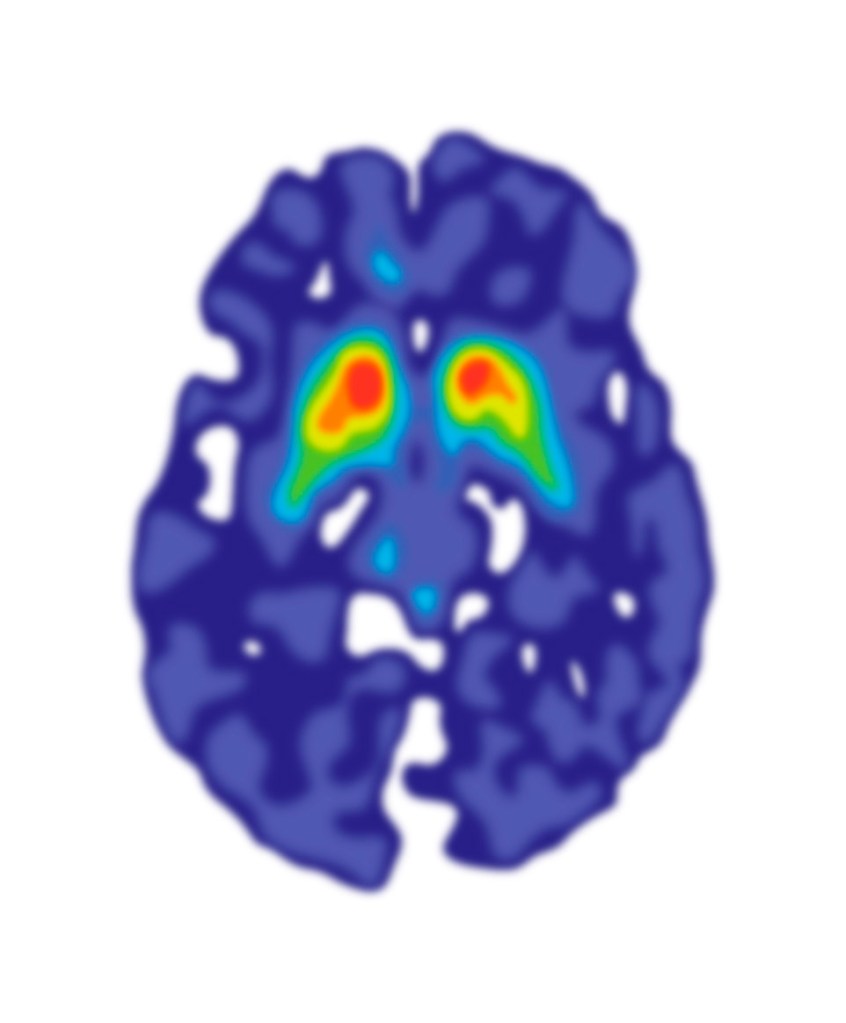
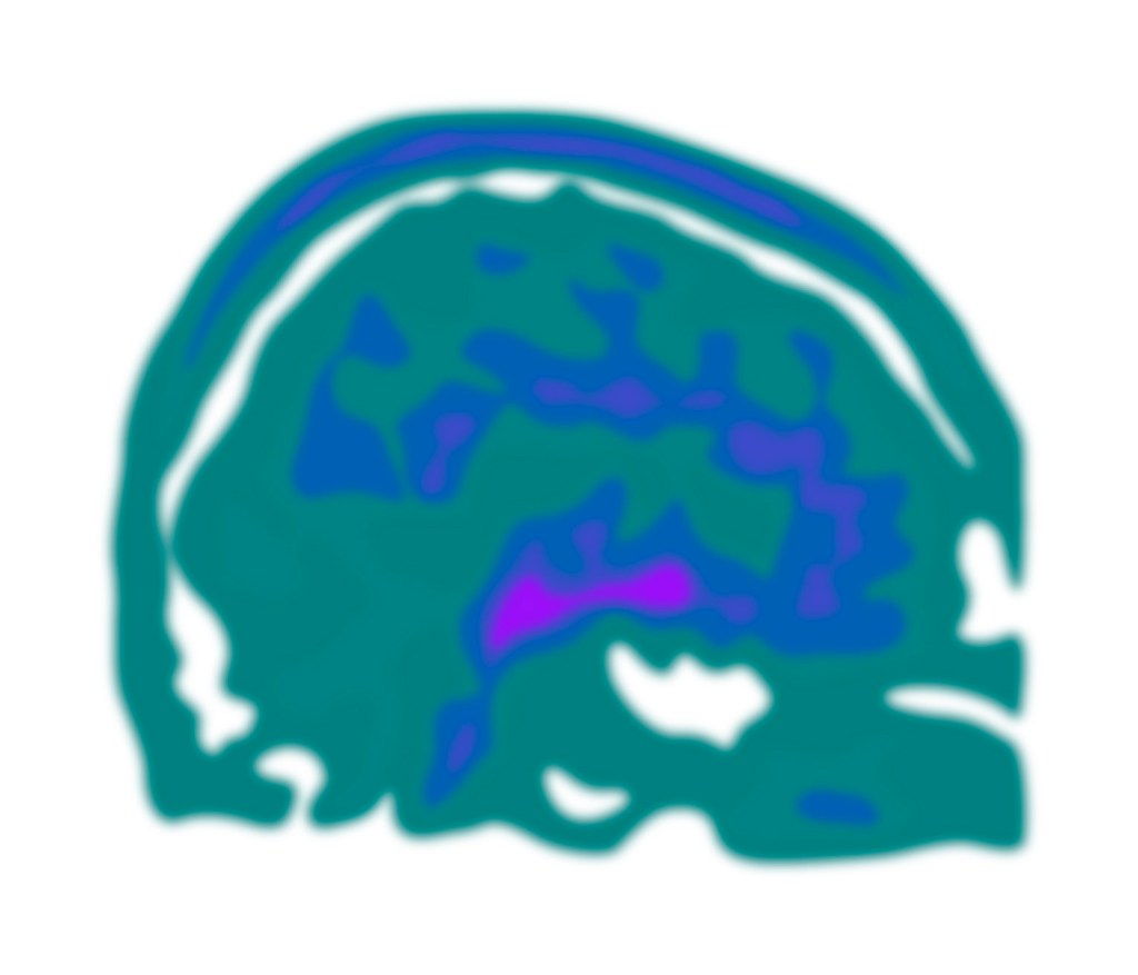
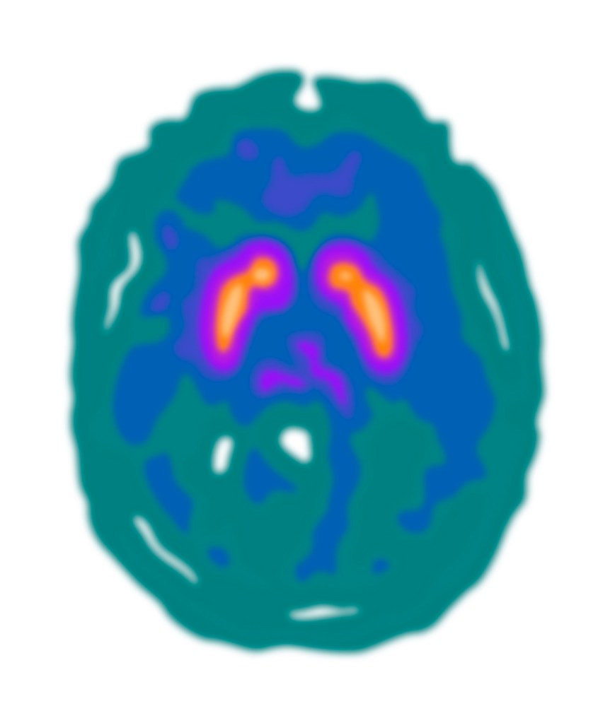
Following the meeting with Giovanna to review the first version of the FDOPA PET Imaging leaflet, Gill worked on the revisions needed to create the second version. Giovanna had provided three different photographic images of PET scans:
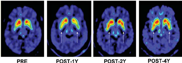
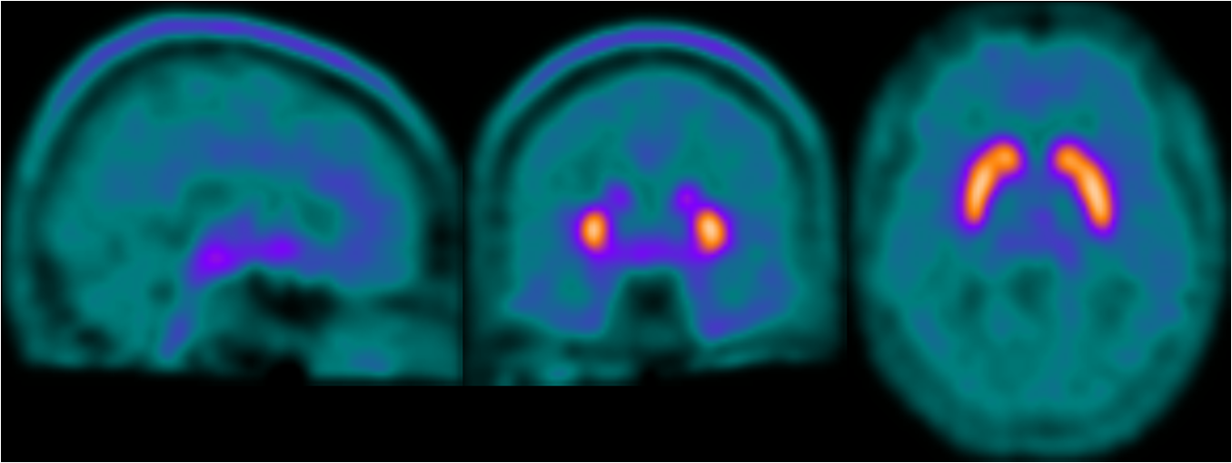
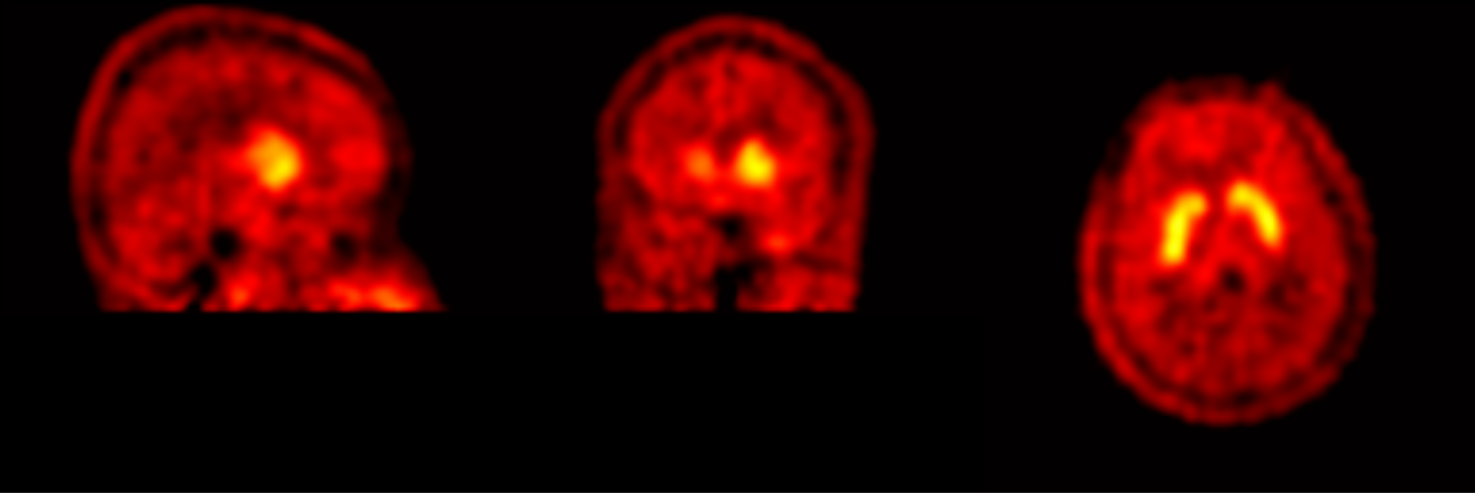
Gill experimented with drawing the rainbow colour-scheme and the blue-green colour scheme PET scans, as the red colour scheme is not as visually appealing and would not work as well with the existing illustrations. The scans will have to be placed on a black background (as in the header image of this post) to look their best, and to match how the scan results appear in the PET imaging software.
Giovanna had also found out that the logos for King’s College London and The Wellcome Trust should be included, alongside the IoPPN logo, and that any readers would be able to make contact via the Neuroimaging Department’s website, molecular-neuroimaging.com.
The Wellcome Trust has a website that supplies its logo in a wide range of colours, and provides guidelines on how to use it. At this stage Gill chose the plain black Wellcome logo on a white background, as the KCL logo is bright red and placing it between the dark blue IoPPN logo and black Wellcome logo may work best.
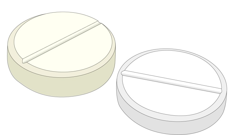

Gill drew an illustration of two generic tablets, making them slightly different in size and colour so that it would be more apparent that the patient is taking two different kinds of medication. She then adapted one of the ‘elapsed time’ illustrations created for the PIS project, to show that the medication is taken one hour before the scan. At this stage Gill made the arrow and time segment the same red as the KCL logo, although the colour can easily be changed as required.
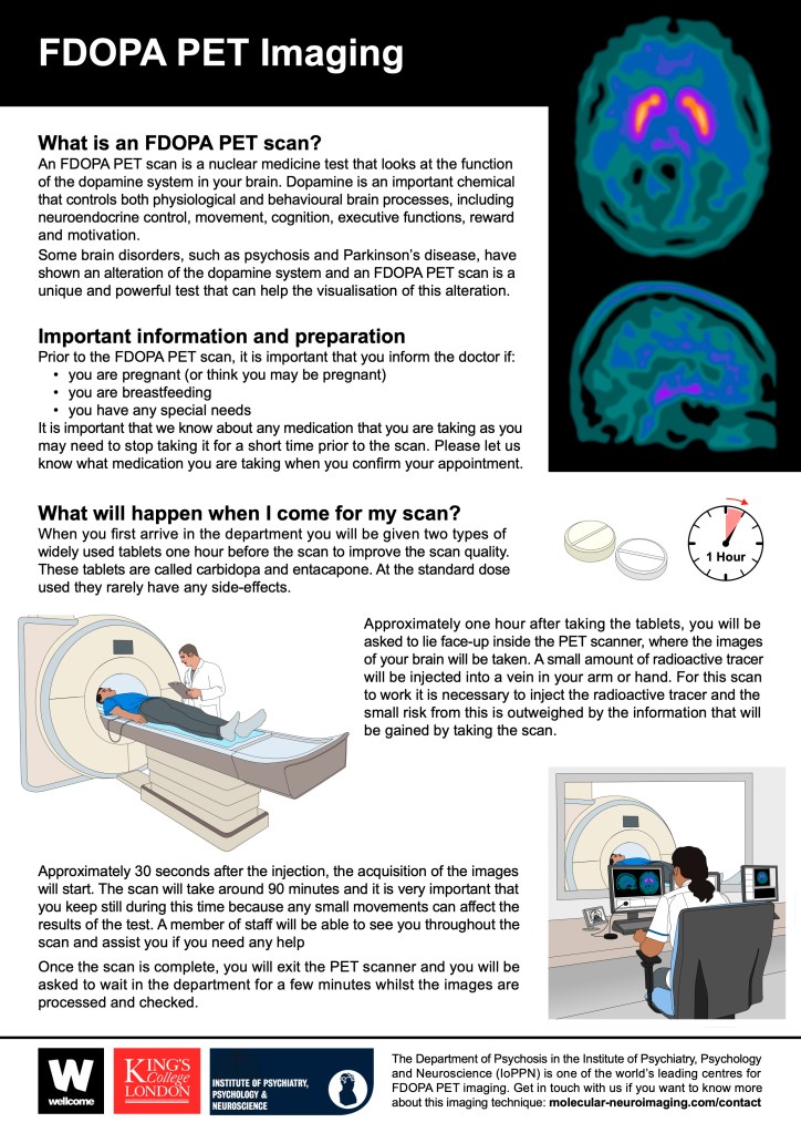
Gill then revised the text to even out the line lengths and adjust spacings. As the PET scans require a black background, Gill extended that down from the title bar. This black are does help to separate the first two sections of the text from the third section, although the layout will probably need more work. Gill added the blue-green PET scan illustrations, although the colours can be changed – it may be worth including some red to tie-in with the KCL logo and the elapsed time image. She also added the blue-green PET scan images to the screens in the radiographer illustration.
The footer space was increased in height, and the point size of the text was reduced, in order to fit in the three logos. The background of the whole leaflet was left white for now, until the colours of the various images has been finalised.
Gill sent this second version of the leaflet to Giovanna and Mattia, for review and feedback.

One Reply to “”