
Gill met with Nisha to discuss progress to date on the conceptual figures that will be required for the upcoming methods paper. Nisha has finished writing the paper, with just the discussion section to finalise, and a decision has been made on the journal to which the paper will be submitted. See this blog post (from June 2017), and this blog post (from last month) for previous discussions regarding the paper.
Nisha confirmed that the paper will require two conceptual figures: one figure will be a flowchart to show the steps followed in the experimental method; the second figure will be a schematic to illustrate the question of whether we can detect the nose-to-brain component of the PET tracer. As is usually the case, the publishing journal sets a limit on the number of figures that can be included in the printed version of the paper, although an unlimited number of figures can be submitted as supplementary material, available online only. No more than seven figures are accepted for print, and most of these will be needed to present data results. Therefore, it may be that the flowchart figure will be combined with the first figure showing results. Combining figures in order to get around the figure limit is common practice, but it can restrict the size allocated to the conceptual component of the figure, compared to a standalone conceptual figure.
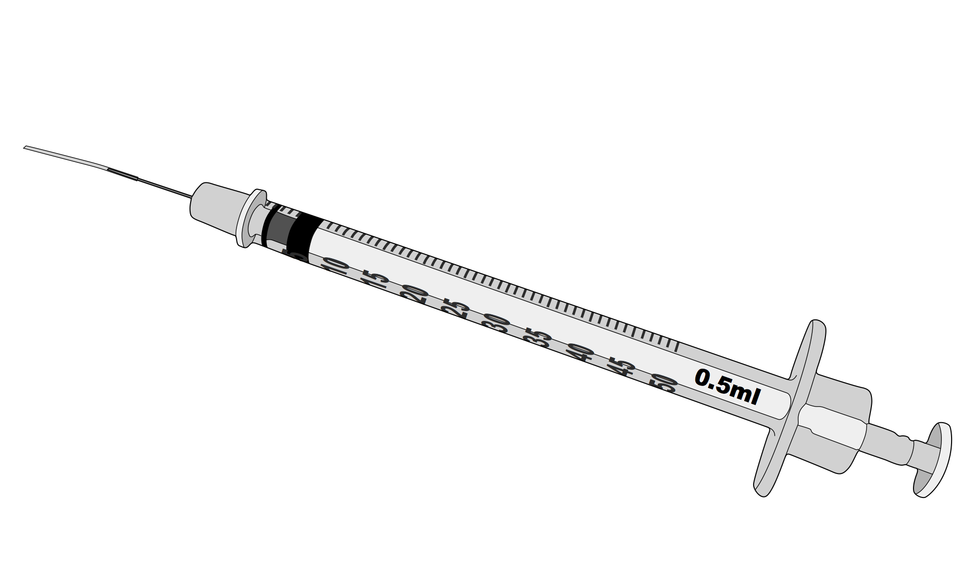
Gill and Nisha reviewed the images that Gill had already produced, primarily of laboratory rats (shown in this blog post). The flowchart figure will require several images of rats and some of the existing images will be edited, mainly in terms of the positioning of the rat, so that they are suitable. Gill will also have to draw some items of laboratory equipment, such as a PET scanner and a syringe (similar to the one shown in the header image), as these will also be used in the flowchart figure. The image of the rat’s head that shows some of the internal anatomy will also be edited and used in the schematic figure. However, all of the images that Gill produces, regardless of whether they are used in the paper, will, in due course, be added to the online image gallery so that can be used or edited by other members of the department.
The publishing journal, in common with many journals, publishes online figures in colour (both the figures included in the paper itself and any submitted as supplementary material). In print, all of the figures are published in greyscale. To print colour figures requires a significant extra payment on the part of the submitting scientists, on top of the fee paid just to publish the paper. The conceptual figures will therefore be printed in greyscale and payment for colour images will be reserved for those figures that contain PET scan images, if they are to be included in the print version of the paper.
The issue of colour and greyscale figures has cropped up repeatedly during the collaboration, proving to be a hot topic during the November workshops. The publishing journals accept only one version of a figure and, as the online journal publishes colour images at no extra cost, most scientists will submit colour figures. These are then automatically converted to greyscale by the journal, often resulting in less than optimum results in terms of the visual communication of the figure. Also, the figure caption can make no reference to the colours, making it problematic to use colour to distinguish between elements within a figure. The effect of converting colour images to greyscale was discussed in detail in this blog post. In the case of the conceptual figures to be produced for this paper, it would be advantageous to use the red-blue colour convention when indicating arteries and veins, which of course will be lost in greyscale. A lot of thought will have to be given to ensure that the conceptual figures communicate well in their greyscale versions; or it may be decided to simply submit them in greyscale, rather than as colour images.
It was agreed that Gill will produce the required visual elements and pass them on to Nisha in Adobe Illustrator format. The final figures can then be assembled in Illustrator, and Nisha can add annotation and text, as necessary.
A thought from the meeting …
Gill previously studied geology, which has a long-established visual language that uses colour conventions when producing geological maps and cross-sections. Certain rock types are assigned certain colours, such as red for granite or yellow for sandstone, to make identification easier. However, there is also a convention for the shadings and hatchings used in black and white line drawings of maps or cross-sections. Limestone, for example, is represented by a brick pattern and slate by closely spaced parallel lines. In this way, if colours are not available (which is often the case if a geologist is mapping in the field) then the rock types can still be clearly indicated.
Although red-blue for arteries and veins is one of the few well-established colour conventions used in neuroscience, there does not appear to be an equivalent convention for images produced in black and white. Bearing in mind how many figures are still printed in greyscale in both books and journals, it would be useful if there were.

One Reply to “”