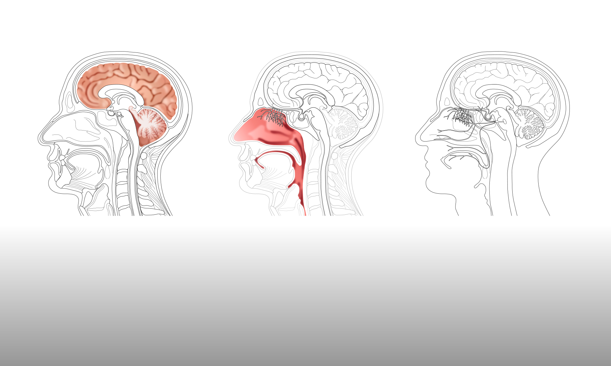

Gill was asked by members of the CNS to help revise two conceptual figures for a journal paper that was about to be submitted. Both of the figures concerned connections between the basal ganglia and other areas of the brain, and so were essentially ‘flowchart-type’ representations, with text boxes connected by arrows. However, the authors of the paper wanted to use a more illustrative, and therefore more visually attractive, image in the first conceptual figure. They asked if Gill could create an image of a transparent ‘3D’ brain that would act as a background to a ‘circuit diagram’-type image, showing the connections between the areas of the brain.
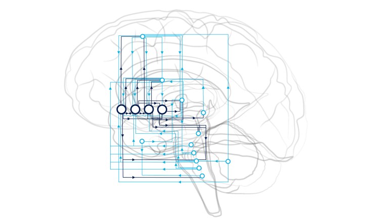
Gill started by drawing in the brain image show on the left in the header image of this blog post. A deliberately informal drawing style was used, when compared to the anatomical brain images that have been produced previously, as the intention was to simply give an impression of the brain structure. Filled areas (shown in the image on the right of the header image) were created on separate layers in Adobe Illustrator, so that they could easily be switched off, if necessary. All of the lines and the fill were made with reduced opacity and were deliberately blurred, to create an impression of transparency.
The main concern was that the background brain image should not detract from the overlying connection diagram and so various image combinations and colour schemes were tried. It was felt that a black background may not print well and so a white background was chosen. Removing the fill simplified the brain image and, because of the relatively complex nature of the overlying connections, it was decided to switch off the filled areas and use only the outline. The outline was changed to a mid-grey colour, rather than black, to further reduce the impact of the brain image.
The original brain connections flowchart had been colour-coded, so that each area of the brain was represented by a different colour. Retaining this colour-coding in the revised ‘circuit-diagram’ drawing created a visually busy image that did not work well when overlain on the brain outline. Instead it was decided that only the connections emanating from the basal ganglia would be differentiated by colour and these connecting lines were also thickened slightly. This final version of this first conceptual figure – minus any text and the figure legend – is shown below. The connections were positioned so that they, very approximately, sat in the correct anatomical area of the underlying brain image.
The second conceptual figure (not shown here) was a relatively simple flowchart and did not contain any illustrative elements. It was not substantially changed from the original, in terms of the scientific information it contained, but was revised to match the style and colour scheme used for the first figure.
Up to this point in the collaboration, Gill had not considered that conceptual figures would necessarily be illustrative. Therefore, to be explicitly asked to create a visually attractive figure, designed to attract attention rather than necessarily impart a lot of detailed scientific information, was somewhat surprising. But producing a visually attractive journal article can obviously be important and is perhaps even more important for posters or presentations.
Gill will add the various versions of the illustrative brain image to the online image gallery, so that they can be used by others in the department.
