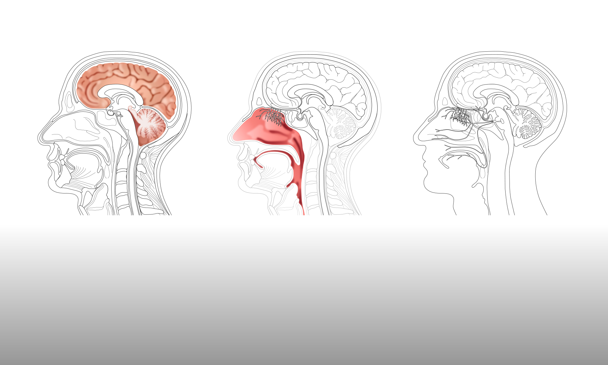

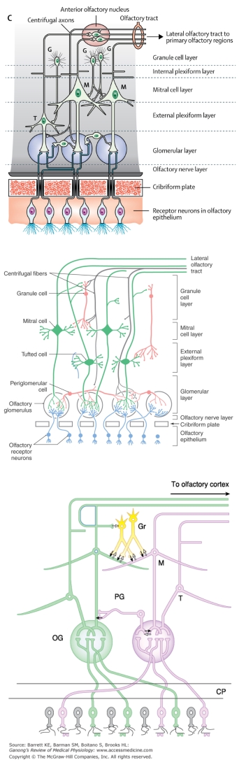
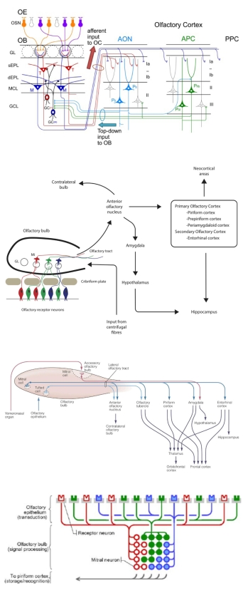
In order to demonstrate visually the continuum of images ranging from the anatomical to the diagrammatic, this post uses a selection of the 2D cross-sections of the olfactory epithelium. These figures all visualise essentially the same thing, the pathway from the epithelium to the olfactory bulb, in very different ways. Arranging the figures in a continuous sequence, as below, does show the progression, but also highlights the similarities and differences between the figures. Comments on this are made after the images:
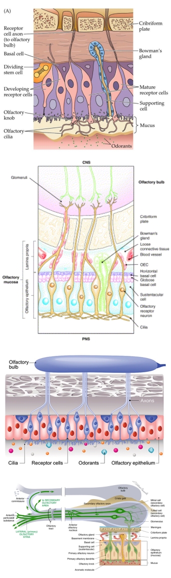
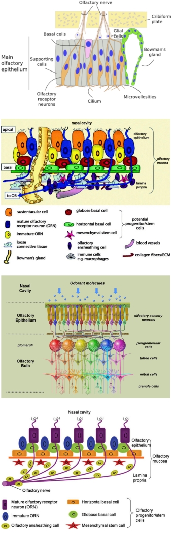
The sequence starts with the images that appears most like an anatomical illustration, due to the chosen colours and the hand-drawn look, although there is inevitably still a large degree of simplification and a stylistic presentation of cell types. Often the image will colour-code elements within the figure, usually the nerves, while maintaining a more ‘realistic’ colour palette for the background anatomy.
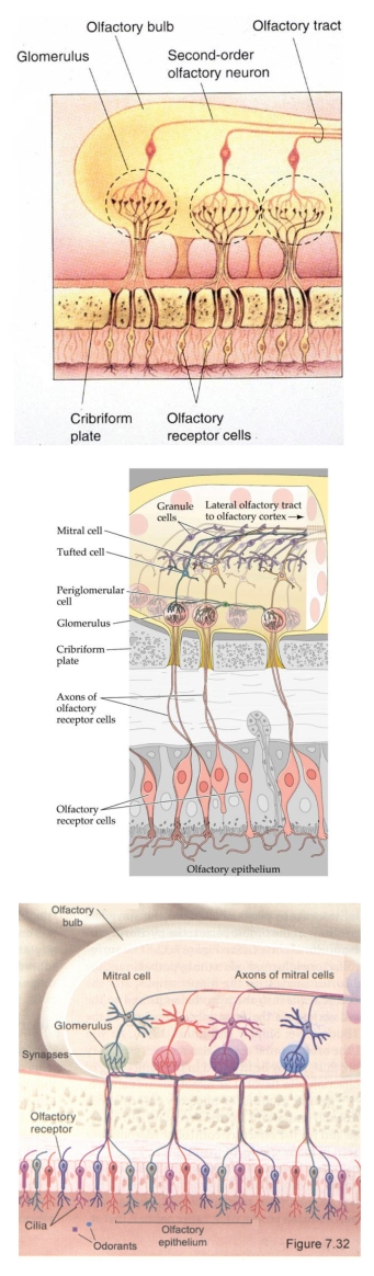
The shapes of the elements then become somewhat simpler and more clearly defined against the background. At times the chosen colours bear no relation to reality, even if the shapes still represent the anatomy. Giving the visual elements a clear and strong outline immediately makes the elements appear more diagrammatic and perhaps like a conventional anatomical illustration. Simplifying the shapes still further and removing some of the anatomical detail, particularly from the background, emphasises the diagrammatic appearance.
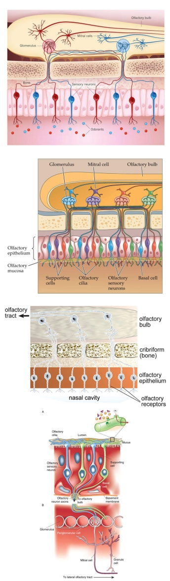
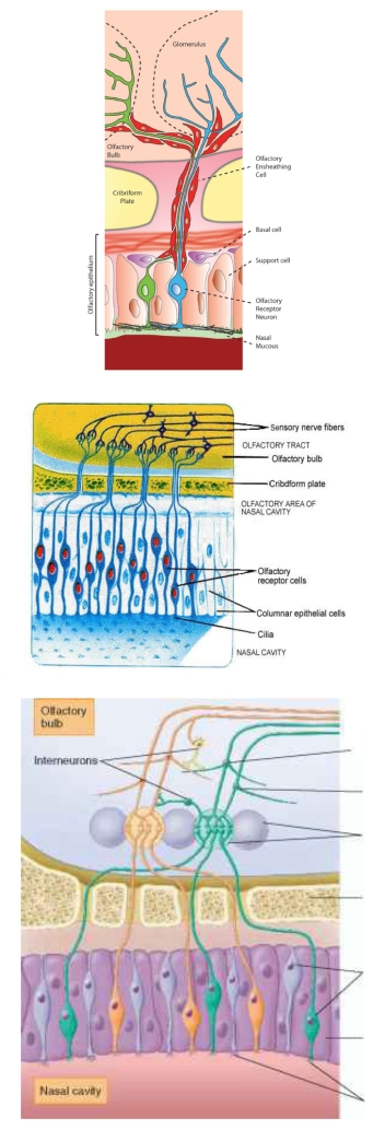
Removing the background anatomical context altogether and highlighting the shapes and connections of the various cell types, often by using bright and definitely un-anatomical colour schemes, moves the images further towards a purely diagrammatic appearance. Although certain indicative cell shapes are still maintained, using strong, straight lines and regular, geometric shapes brings to mind technical system diagrams rather than a representation of mammalian anatomy. Finally, most, if not all, of the biological representations are replaced, either by text or by simple geometric shapes. Only the labelling gives any indication that the diagram is an anatomical representation.
A scientist has to select an image, from somewhere along this continuum, that best reflects and communicates the information they are trying to impart to a viewer. Making the wrong choice can confuse or hinder that visual communication.
Arranging the figures in sequence in this way also demonstrates how difficult it is to categorise scientific conceptual figures into separate groups, based on their appearance. There is always an overlap between the various visual representations, which makes it impossible to define a demarcation between types of image. But is it even necessary or desirable to group these kind of images based solely on how they look? The science contained within the image, together with the wider context, has to be taken into account.

One Reply to “”